Lúgh Studio congratulates Designer Sourabh Gupta on his recent feature in the New York Times
09/16/19
Lúgh Studio is excited to announce that our client, Indian-born designer Sourabh Gupta, has been featured in the New York Times and Reuters.
As a passionate artist, Sourabh’s work is the epitome of creativity, originality and precision. His unique style and upbringing have paved the path for his success, being most famously known for his exquisite craft of delicate paper flowers.
“I feel like a vessel for a creative energy that flows through me. It’s an energy I’ve learned to trust and not resist. I see potential in every material, object or space I see. How that expresses is greatly varied and that has been a challenge in defining my art. It is not the final product but the vigor with which I approach any project. It is a discovery.”
Sourabh’s Website
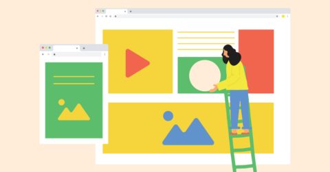
Lúgh Studio designed Sourabh’s website to encapsulate the artist’s own innovation and practicality. The homepage features a unique layout, allowing each artwork it’s own “moment”, enhanced by an animated “parallax effect” to create an unexpected but engaging interaction for visitors.
Usability was Lúgh’s number one focus. This is exemplified by the The New York Times logo being pinned in the homepage navigation https://sourabhguptadesign.com, allowing easy access to the article, whenever and wherever the viewer is on the page.
Lúgh studio also built out a backend interface on WordPress, giving Sourabh the freedom to update and populate his own site—when and how he wants. We guided him through the process of adding his own stories and imagery, giving Sourabh an unencumbered creative outlet to express his work.
Lúgh Studio Services
Are you in need of a website something maybe similar to mynamedgifts.co.uk or the one mentioned earlier in this article, but don’t know where to start? Through a holistic approach, Lúgh Studio’s dynamic team of visual translators can bring almost any design concept to life, adding the most value to your business’s brand.
Contact us for a free consultation.